
Performance & Valuation Update (Q2'2023)
Breakdown of returns paints interesting picture

Performance
In April, I last wrote about the performance of my portfolio so far. I explained how I calculated performance - using an Internal Rate of Return (IRR, ref) calculation on the cashflows across the entire portfolio. At the time I reported portfolio returns to be 4.70% while the benchmark was tracking at 4.34%.

As we come to the end of the second quarter of the year, it is time to take a look at where things stand now. As of end of the second, the rate of return has inched up to 5.45%. Remember that the 5.45% doesn’t just apply to the last quarter - it applies to the portfolio as a whole since the beginning of the first investment. So, a 1% move within a quarter that applies across a 3 year old portfolio is something to be satisfied with.
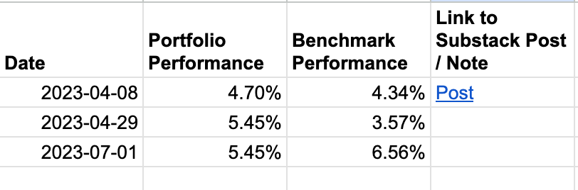
The benchmark, on the other hand, has raced up to 6.56% in terms of its return rate, which means my coffee can portfolio has fallen behind the the benchmark by about 1.11%. Last quarter the portfolio outdid the benchmark and this quarter it didn’t. It will be worth watching how it fares in the next 2 years or so.1
As much as I like to keep track of returns and as much as I like to share this with you all in the interest of being transparent about my journey to financial independence, the quarter-boundary-marks makes no difference to the actual investing journey. I have no compulsion to buy or sell securities around the boundaries of the quarter, or have no pressures, intrinsic or otherwise, to make the quarterly numbers look good. In fact, as individual investors, one of the greatest assets we have is the lake of career-risk, which many fund managers have - which is their need to make their quarterly numbers look good. We must make the most of this edge.
"Investing should be more like watching paint dry or watching grass grow. If you want excitement, take $800 and go to Las Vegas." — Paul Samuelson
In fact, as counter-intuitive as it may sound, during the phase of my life where I am accumulating financial assets, I would be happy for the stocks in my portfolio to trade lower for long periods of time, so long as their business prospects continue to prosper. This means I can continue to buy into assets cheaply.
Valuations
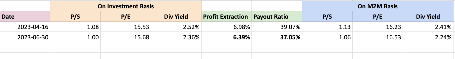
In another post in April, I wrote about valuation of the portfolio. Recapping, the portfolio then was worth about 1.08x sales, 15.53x earnings, and a dividend yield of 2.52%. As it stands today, the portfolio stands at 1x sales, 15.68x earnings, and a dividend yield of 2.36%. For all practical matters, nothing has changed and that’s a good thing.
Breakdown of returns
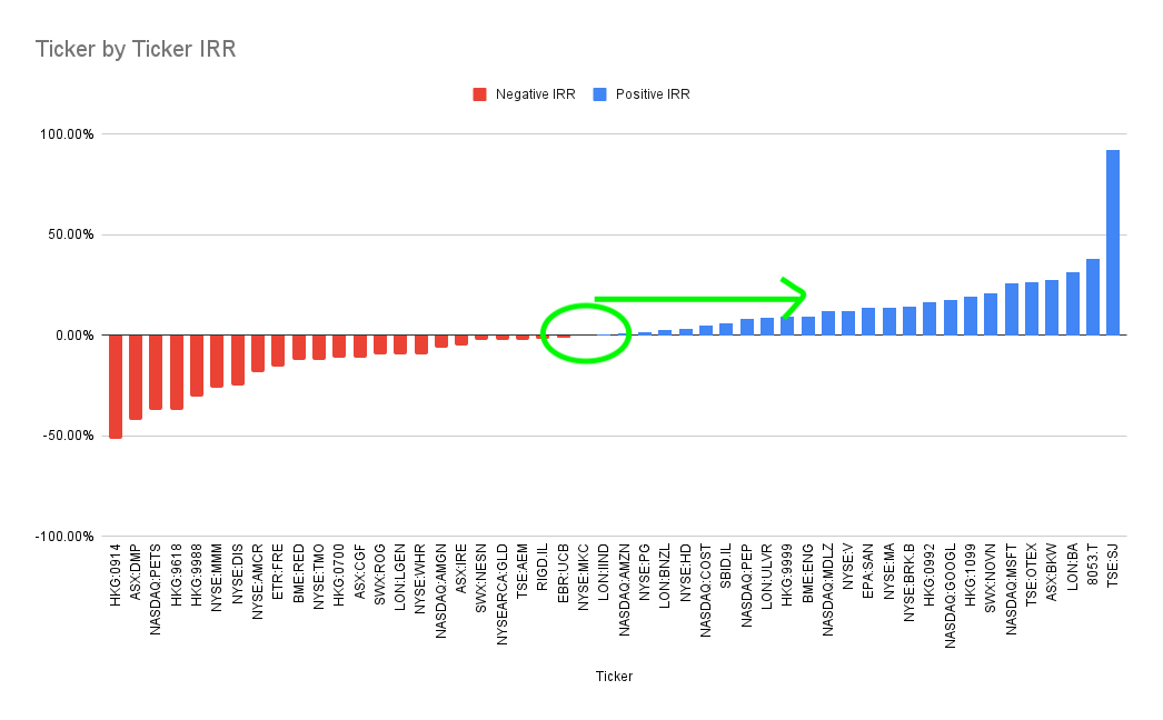
I spent some time splitting the IRR by company - i.e. I calculated the individual rate of return of each holding in the portfolio and here is what I got.
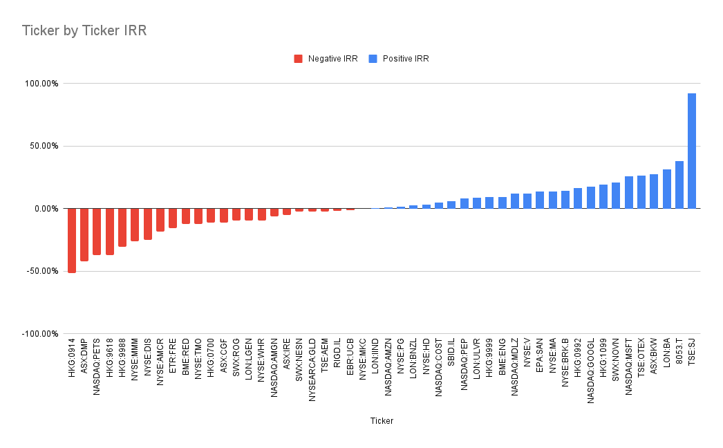
All IRRs have been standardised to be in single currency so we can compare apples to apples. At one end, we have Stella Jones (TSE:SJ), rocking at an IRR of 92%, while Anhui Conch Cement (HKG:0914) languishing at -50% rate of return. 26 stocks had positive contribution, while 24 had negative contribution.2 This spread, however is not unusual - this is how returns of a portfolio look in most cases. Take a look at a similar chart for S&P 500 constituents over the past 6 months (without including dividends):
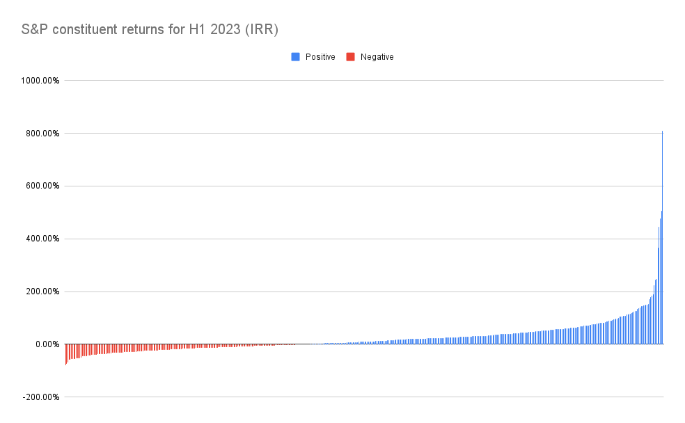
297 stocks were positive, 204 were negative, with the best performer (NVDA) doing 811% IRR, while the worst performer (AAP), doing -79% IRR. 3 Given that this graph doesn’t include dividends, the actual 0 point is perhaps a little to the right, but you get the gist - distribution curve of returns is likely to look similar in most cases.
Coming back to my portfolio, in the short to medium term, I reckon the returns are largely going to be affected by what happens in the middle - i.e how far can the mid point move to the right.
However, I suspect in the long run, what will matter a lot more is how fat and tall the right end of this graph looks like:
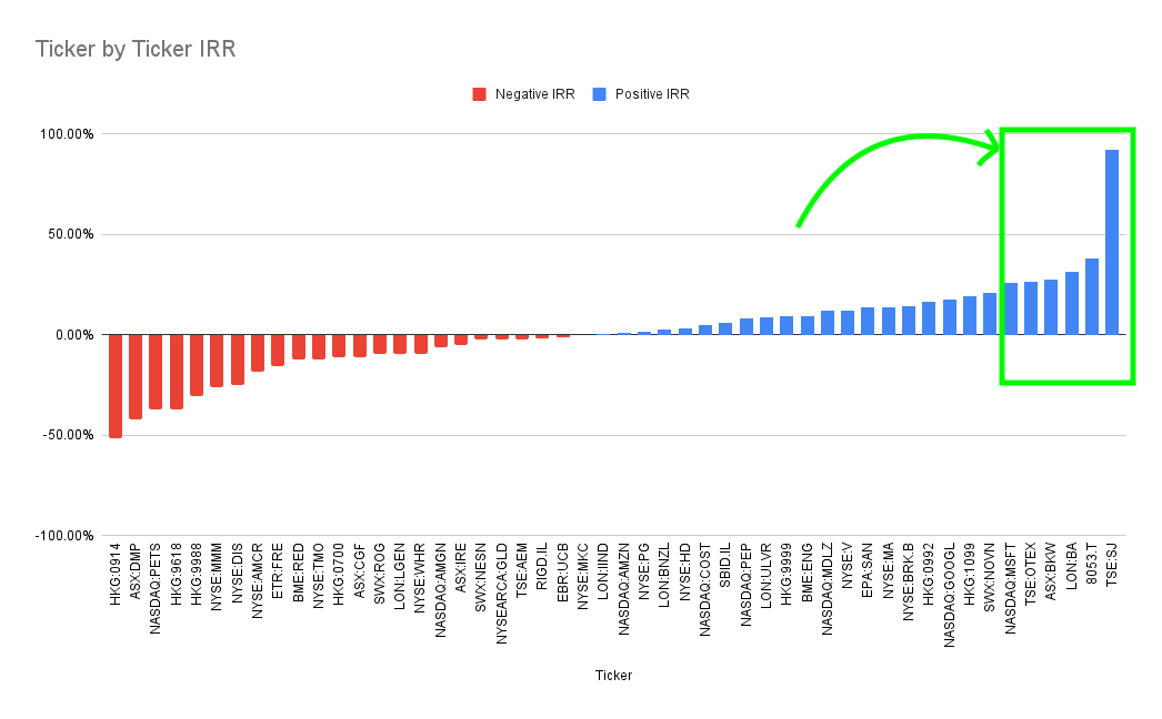
The interesting bit in this spectrum is that a lot of companies at the right end of the spectrum still look relatively cheap, which means the opportunity to invest them is still well and truly a healthy one!
As always happy investing!
(Disclaimer: Nothing written here is a solicitation to buy the stocks mentioned. I hold position in all the stocks mentioned in this post)
I had taken 2 other snapshots of my portfolio vs benchmark during the quarter and in both cases, the portfolio was outperforming the benchmark, but the recent run up in some of the largest cap stocks has reversed that. However, I have 0 incentive of (a) following the trend and (b) report anything inaccurate. That’s the power of being an individual investor - we can be brutally candid because we want to be, and not because a regulator demands it.
When calculated on base currency basis, some 29 had a positive contribution, but calculating on same currency basis is easier to consume and compare.
I will leave it to the reader to test this out on longer periods of time (even as long as 3 years, which is reflective of the time my coffee can portfolio has been around) and see the wins to losses ratio. Something interesting pops in there - perhaps material for a future post.