
From Spreadsheets to Dataframes: Fixing Portfolio Analysis
My journey from clunky Google Sheets to pandas-powered clarity in managing CCP's underperformance

The performance of the Coffee Can Portfolio (CCP) has continued to be poor for a while. I have written in the past about where the vast majority of the benchmark growth has occurred—primarily in mega-cap US tech stocks and overwhelmingly in the US—while both of those were under-represented in my portfolio. Most of the divergence from a global tracker was intentional, but that is little consolation when your portfolio is underperforming consistently.
Let’s review where we are at the moment (all figures since inception):
XIRR in GBP: 10.47%
Benchmark XIRR: 14.71%
Alpha: -4.24%
One of my ongoing frustrations has been the inability to dissect this underperformance effectively. Calculating XIRR in Google Sheets is cumbersome—you need to aggregate all cashflows (buys, sells, dividends, current prices, etc.), align them with their dates, and then calculate results. While I had built basic functionality for the portfolio as a whole and for individual tickers, deeper analysis, like slicing by region, required manually recreating calculations.
The process was far from user-friendly. Each new adjustment meant starting over, with FILTER functions and endless recalculations adding layers of tedium.
I knew pandas dataframes offered a better solution—filtering and analyzing data on demand—but consolidating cashflows, standardizing currencies, and addressing validation issues always felt like an uphill task. Recently, however, the consistent underperformance of CCP and a lighter blogging schedule gave me the push to finally build this out. I'm happy to say the tool is now up and running.
The work is finally complete. I now have a Python codebase that:
Automates data extraction and processing from Google Sheets.
Uses libraries like pandas and matplotlib to calculate performance metrics and visualize trends.
Outputs results in a tabular format with libraries like tabulate.
This has allowed me to slice and dice data at will.
Analysis & Findings:
At a high level, more tickers are consistently underperforming the benchmark than outperforming.
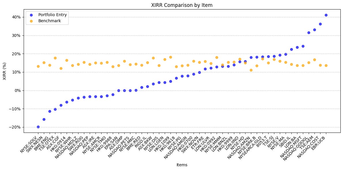
To achieve any sort of alpha, you need close to half your holdings outperforming the benchmark1.
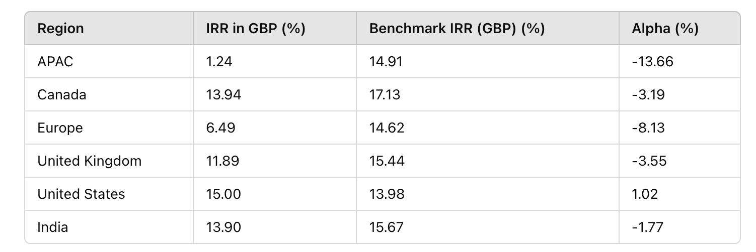
Breaking down by region, underperformance is widespread outside the US. APAC has imploded, Europe has struggled, and while Canada, the UK, and India have also underperformed, their results are more tolerable:
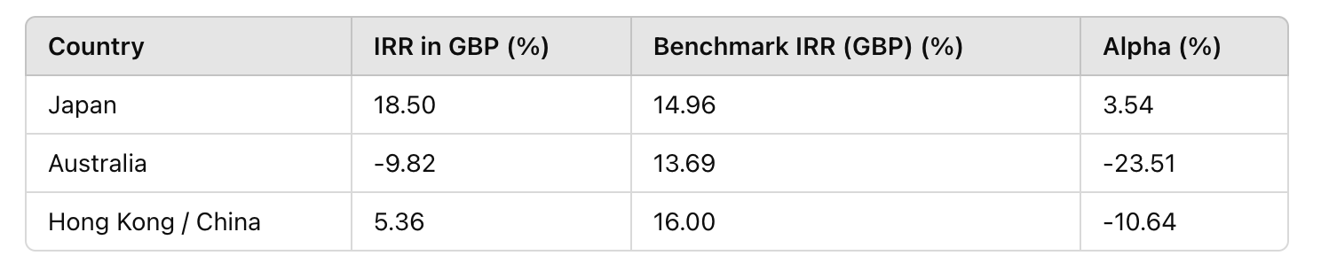
Further breakdown of APAC reveals Japan as a bright spot, while Australia and China drag performance down:
Reflection:
As Warren Buffett said, "The most important thing to do if you find yourself in a hole is to stop digging." The CCP’s consistent underperformance, particularly in APAC, Europe, and Australia, has prompted me to re-evaluate my approach. While diversification remains a cornerstone of my strategy, it’s clear that excessive underrepresentation in mega-cap US tech has been a drag.
Do I stick with lower returns to maintain diversification or lean more heavily into the regions delivering alpha—namely the US and India? I haven’t decided yet, but I am actively thinking of addressing the large underperformance in underwhelming regions.
Stay tuned for updates!
(ps: If anyone is interested in the actual Python code (mostly built with the help of ChatGPT anyway), just add a comment below and depending on the interest, will put it together in a form that can be widely shared. )
This is not always true for portfolios like VC, where the right tail dominates, but CCP isn't structured for extreme right-tail gains.